Wednesday, December 15, 2010

Photography work featured in group show

SAIC and Palmer House Hotel Develop Ongoing Exhibition

An ongoing exhibition of SAIC student work opens December 16 in the main lobby of the historic Palmer House Hilton Hotel, 17 East Monroe Street. Thirteen students in the class Palmer House: Honoré's Gift, led by SAIC faculty member Lewis Kostiner, will present photography, design, and architecture projects across media in a periodically rotating show. Inspired by complete access to the hotel, including areas generally off limits to guests, each student is working on a particular aspect of the hotel that has piqued his or her interest.

Artists include Alex Zhang, Alysha Scott, Anna Wolak, Austin Fuller, Ben Pegram, Daniel Dietzel, Elaine Li, Elliott Franklin, Eric Rowan, Julia Lachman, Kelly Morrison, Mary Clemens, and Sunwha Her. (source)

Saturday, November 20, 2010

Thanks for supporting me at SAIC's Holiday Art Sale!
Hope to see you next semester :)

Friday, November 5, 2010

MISC- wedding congrats card

This is a card I made for my friend's wedding. The newlyweds are both graphic designers, so I played on the designer geekery type of idea... as in... cmyk/rgb.

cymk (congrats on your marriage) envelope
rgb (rings groom bride) card

Friday, October 22, 2010

STA's Archive10

Alphabet Door Hanger is part of STA's Archive10!
http://archive.sta-chicago.org/2010/10/winning-entries/
Thanks for the great documentation.
More alphabets coming up :)

Tuesday, October 5, 2010

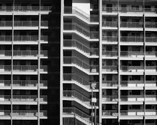
PH- Untitled

Untitled (Chicago) | 16"x20" | 2010
Untitled (Hong Kong) | 16"x20" | 2010
Untitled (Public Housing) | 16"x20" | 2009
Available for purchase.

Tuesday, September 28, 2010

MISC- "Dear Art School Students" soap bar

available in white, baby pink or baby blue.


this is a concept work. no such product has been made... yet...

Sunday, August 1, 2010

VCD- Modular System

Beginning Graphic Design (Daniel Morgenthaler)
Summer 2010

This project was to design a grid that can serve as a matrix for extracting a set of 9 linear forms that are visually related. I created a grid with circles and straight lines, creating abstract and geometric forms by extracting the features. We then had to use these forms to create a 'paragraph' as though it is a typeface.

Monday, July 26, 2010

VCD- Tiananmen Square Protests Timeline

Beginning Graphic Design (Daniel Morgenthaler)
Summer 2010

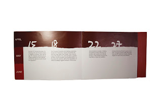
The dot and the line: This project incorporates written and pictorial information of an actual occurrence into the sequential format of a book. I chose a historical event since there are facts and figures. I decided to work on the Tiananmen Square Protests, first because of my lack of knowledge on the exact events day-by-day, second because this topic is censored in Mainland China, which I personally believe that it shouldn't.

There are 16 pages in the book, and I designed it in a way that gives readers a clear and concise explanation of the dates of the events. The pages at the center are narrower than the first and last, so that readers have a flow of the dates, and can go back and forth.

Interior


Thursday, July 22, 2010

MISC- Adobe CS

So I was thinking... Adobe Creative Suite... literally...
as in.. hotel suites....

Tuesday, July 20, 2010

VCD- Exhibition poster

Beginning Graphic Design (Daniel Morgenthaler)
Summer 2010


Photo by Elaine Li at the Modern Wing

Monday, July 12, 2010

MISC- Design Schematic

My graphic design instructor showed us this chart by Allen Hurlburt. I tried looking for it on Google but couldn't find it, and so I just recreated it with a touch of RGBCMYK :)

Friday, July 9, 2010

VCD- Kronos Quartet announcement

Beginning Typography (Stephen Farrell)
Summer 2010
By using the four pieces of information given in the project brief (Kronos Quartet, the members, performance pieces, date, time, and venue), I created 3 different layouts for this typographic announcement, based on grid and font combination studies. These are 8x8" in size.
1. Univers 45 Light, 47 Light Condensed, 55 Regular, 65 Bold
2. Univers 45 Light, 55 Regular, 65 Bold
3. Gill Sans MT, Scotch Roman MT

Wednesday, July 7, 2010

VCD- The Telephone Book

Beginning Typography (Stephen Farrell)
Summer 2010

This assignment was to create layouts for a 5.5x8.5" typographic book cover with the use of Franklin Gothic book and Franklin Gothic demi, creating hierarchy through arrangement of text in space.

Layout that emphasize the title of the book

Layout that emphasize the subtitle of the book

Layout that emphasize the author of the book

Friday, May 7, 2010

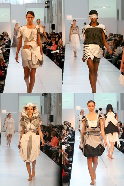
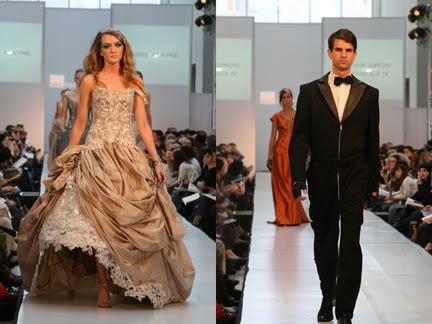
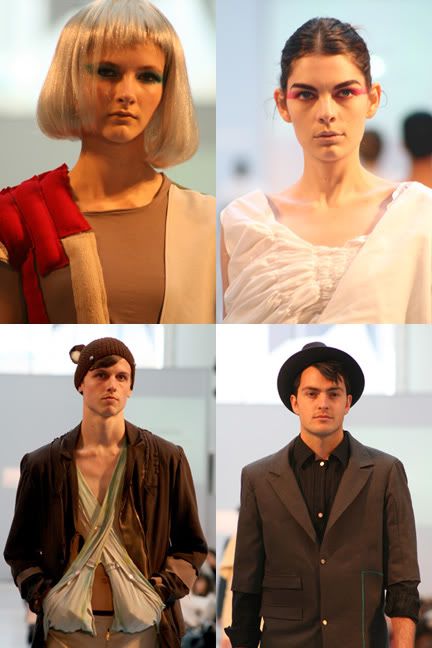
PH- SAIC Fashion Show 2010

I went to the rehearsal of our school's fashion show at the Modern Wing. Here are some photos I took:

Sophomore

Junior

Close-ups

More photos on my facebook album

Sunday, May 2, 2010

VCD- Exhibition catalogue

Beginning Typography (Kristin Tomsit)
Spring 2010
Final Project: Diane Arbus Exhibition catalogue
Exterior
Interior

Friday, April 16, 2010

Updates

Hi! A quick update-

Union League Civic & Arts Foundation
I submitted Got Rice? and Mao, Kim and Dalai Lama from the Male Leaders series to the Visual Arts Competition, and have been selected as a finalist for the 2010 Visual Arts Competition. The second round judgingwill occur at the Heritage Room of the Union League Club (65 W. Jackson Blvd) on Thursday, May 20 from 5 until 7 pm. More details coming up.

Artbash 2010
Selected work from the Male Leader series in Artbash 2010 at the Betty Rymer Gallery (280 S. Michigan). The show is opening on tonight (April 16th) from 4:30. Artbash 2010 goes from April 16 to 30th.

Rubber Cement
Graphic design work Baskerville typeface poster is currently on display in the Rubber Cement: Intro to Vis Com exhibition in Sharp Building 11th floor (37th S. Wabash).

The Spring Art Sale
Thanks to those who came to the Art Sale and looked at my work, and a big big thank you to those who bought my prints, I am really grateful and I hope that you are happy with them.
P.S. The gentleman who bought the 'Untitled0220' piece - I still have the piece with me if you would like to pick it up soon. Or you can contact me at 312.860.8899. Hope to hear from you soon :)

Wednesday, April 14, 2010

VID- Blood Donation (2008)

Self-initiated project
30 sec TVC for Australian Red Cross

This is one of my portfolio work for college application from 2008. I created this 'animation' by merging nine image files with Windows Movie Maker.
This commercial is based on a set of ‘upside-down’ font that I created. The font is based on Times New Roman, in which letters are rotated 180° but still make sense. The idea of this advertisement is to promote blood donation, in which the viewer tries to make sense of ‘poolq’ then realizes that it is the upside down version of ‘blood’. I hope to promote the idea of standing in other’s shoes, to see in other’s perspective. I hope audience would turn their heads upside down to view the word ‘blood’.

Thursday, April 8, 2010

Spring Art Sale

Some examples of photography work I am selling.


Fine art work such as Got Rice and Male Leaders series will also be displayed.