This photo that I took reminds me of the painting American Gothic by Grant Wood, which is even more interesting since it was shot right outside the Art Institute. (American Gothic is in the AIC's collection)
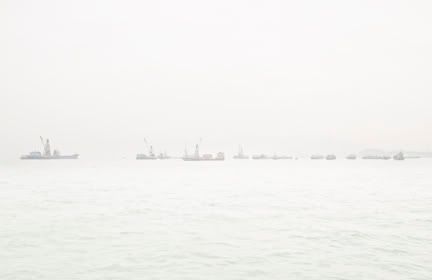
I overexposed this image to emphasize on the pure natural landscape (sky and sea), yet this is interrupted and disturbed by manmade industrial transportation.
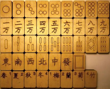
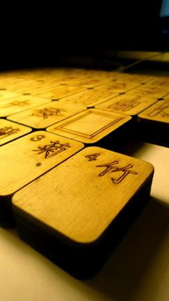
I had some leftover wood from last semester, so this week I decided to use it, spent a few hours in my spare time and made this. They aren't as yellow as they seem. i just couldn't get hold of tungsten lighting...
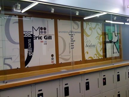
The assignment was to create a poster that tells the features of a specific typeface - mine being Baskerville. I created this T shape structure as the main layout, then add smaller snipets of text to create hiearchy and dimension.
I am a Visual Communications Design student at the School of the Art Institute of Chicago (SAIC). Apart from graphic design, I also do photography work and is interested in multimedia.