
Intermediate Typography (Mark Stammers)
Spring 2011
Showing posts with label SAIC. Show all posts
Showing posts with label SAIC. Show all posts
Friday, April 29, 2011


Thursday, April 7, 2011
VCD- lecture series poster
Intermediate Typography (Mark Stammers)
Spring 2011
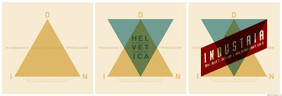
The project brief was to create a typographic poster for a lecture series announcement. I played with the words architecture and lecture, and created a structural flow to the piece.
The poster is A1 in size.
Spring 2011
The project brief was to create a typographic poster for a lecture series announcement. I played with the words architecture and lecture, and created a structural flow to the piece.
The poster is A1 in size.

Monday, January 3, 2011
VCD- "Up in the Air" film title
Computer as Motion Tool (Caroline Young)
Fall 2010
Fall 2010
My first attempt in using Adobe AfterEffects. The assignment was to make a film title for a motion picture that features at least 8 titles. I chose one of my favorite movies, Up in the Air, which features George Clooney as Ryan Bingham, who makes a living traveling to workplaces around the US, and conducting layoffs for bosses who are too cowardly to do it themselves. He promotes the virtues of a life, free of relationships with people and things through motivational speeches.
Since Ryan Bingham is always travelling, I focused on the carry-on suitcase for business travel. The opening credits goes in and out of a suitcase with titles superimposed on credit cards, travelers cards, clothing tags and personal hygiene items etc. The music I used is "Security Ballet" by Rolfe Kent to give a light feel while expressing Bingham's confident and effective personality.

"Up in the Air" film title from Elaine Li on Vimeo.
(password: lielaine)
Sunday, August 1, 2010
VCD- Modular System
Beginning Graphic Design (Daniel Morgenthaler)
Summer 2010

Summer 2010
This project was to design a grid that can serve as a matrix for extracting a set of 9 linear forms that are visually related. I created a grid with circles and straight lines, creating abstract and geometric forms by extracting the features. We then had to use these forms to create a 'paragraph' as though it is a typeface.

Monday, July 26, 2010
VCD- Tiananmen Square Protests Timeline
Beginning Graphic Design (Daniel Morgenthaler)
Summer 2010
Summer 2010
The dot and the line: This project incorporates written and pictorial information of an actual occurrence into the sequential format of a book. I chose a historical event since there are facts and figures. I decided to work on the Tiananmen Square Protests, first because of my lack of knowledge on the exact events day-by-day, second because this topic is censored in Mainland China, which I personally believe that it shouldn't.
There are 16 pages in the book, and I designed it in a way that gives readers a clear and concise explanation of the dates of the events. The pages at the center are narrower than the first and last, so that readers have a flow of the dates, and can go back and forth.


Tuesday, July 20, 2010


Friday, July 9, 2010
VCD- Kronos Quartet announcement
Beginning Typography (Stephen Farrell)


Summer 2010
By using the four pieces of information given in the project brief (Kronos Quartet, the members, performance pieces, date, time, and venue), I created 3 different layouts for this typographic announcement, based on grid and font combination studies. These are 8x8" in size.


2. Univers 45 Light, 55 Regular, 65 Bold
3. Gill Sans MT, Scotch Roman MT
Wednesday, July 7, 2010
VCD- The Telephone Book
Beginning Typography (Stephen Farrell)
Summer 2010
.jpg)
2.jpg)
.jpg)
2.jpg)
This assignment was to create layouts for a 5.5x8.5" typographic book cover with the use of Franklin Gothic book and Franklin Gothic demi, creating hierarchy through arrangement of text in space.
Layout that emphasize the title of the book
.jpg)
2.jpg)
.jpg)
2.jpg)
.jpg)
Saturday, April 3, 2010
VCD- Book covers
Image Studio (Alysia Kaplan)
Spring 2010
Project #2: Animal Farm book cover
I enlarged the pig that’s sitting on the horse to show power. I also added decorations on the pigs on the back cover to express materialism. The decorations are patterns from US dollar bills.

1984 book cover
My aim is to communicate the idea of surveillance through a simple layout. Black dominates the background with an eye (Big Brother) staring down to the white space.

Thursday, March 4, 2010
VCD- Average Letter
Beginning Typography (Kristin Tomsits)
Spring 2010
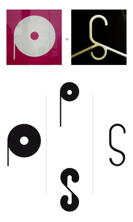
Project #1: Averaged letter (merging two fonts into one)
Tuesday, February 16, 2010


Thursday, January 28, 2010
VCD- Type & Image
Intro to Vis Comm (Mark Stammers)
Fall 2009
Project 3: Type & Image

The assignment was to create an 8-page accordion fold booklet using a four letter word and photographs that we took. I chose 'face' and used photos of different facial features. This was especially challenging since I didn't have a wide choice of things to photograph, there are only five features on our faces and I didn't want to overlap any of them.
Wednesday, December 23, 2009
PH- Got rice? (2009)
This is a parody advertisement I did for Research Studio II. It features myself as the selected celebrity for the got rice campaign. Would an Asian version of the 'Got Milk' campaign look like this? Why do we recognize the milk/rice mustache? This piece not only explores Asian community in American context, but also the effect advertising has on the general population. We are surrounded by advertisements, and are influenced by them unconsciously. The mustache is such an icon of this ad that it has already been embedded in our heads. After completing this work, I found there was indeed a Got Rice campaign by Asian American youth in the 90s.

Thursday, December 3, 2009


Sunday, November 22, 2009

Tuesday, October 20, 2009


Subscribe to:
Posts (Atom)


 Posts
Posts

